About
Est. 2012) Lunya is a sleep and loungewear company based in Los Angeles, CA. “We’re reinventing sleepwear for the modern woman. Our pieces are carefully crafted for the important part of your day— your Otium hours. Whether you’re just waking up or calling it a night, Lunya is your daily reminder to find beauty in the everyday.”
CHALLENGE
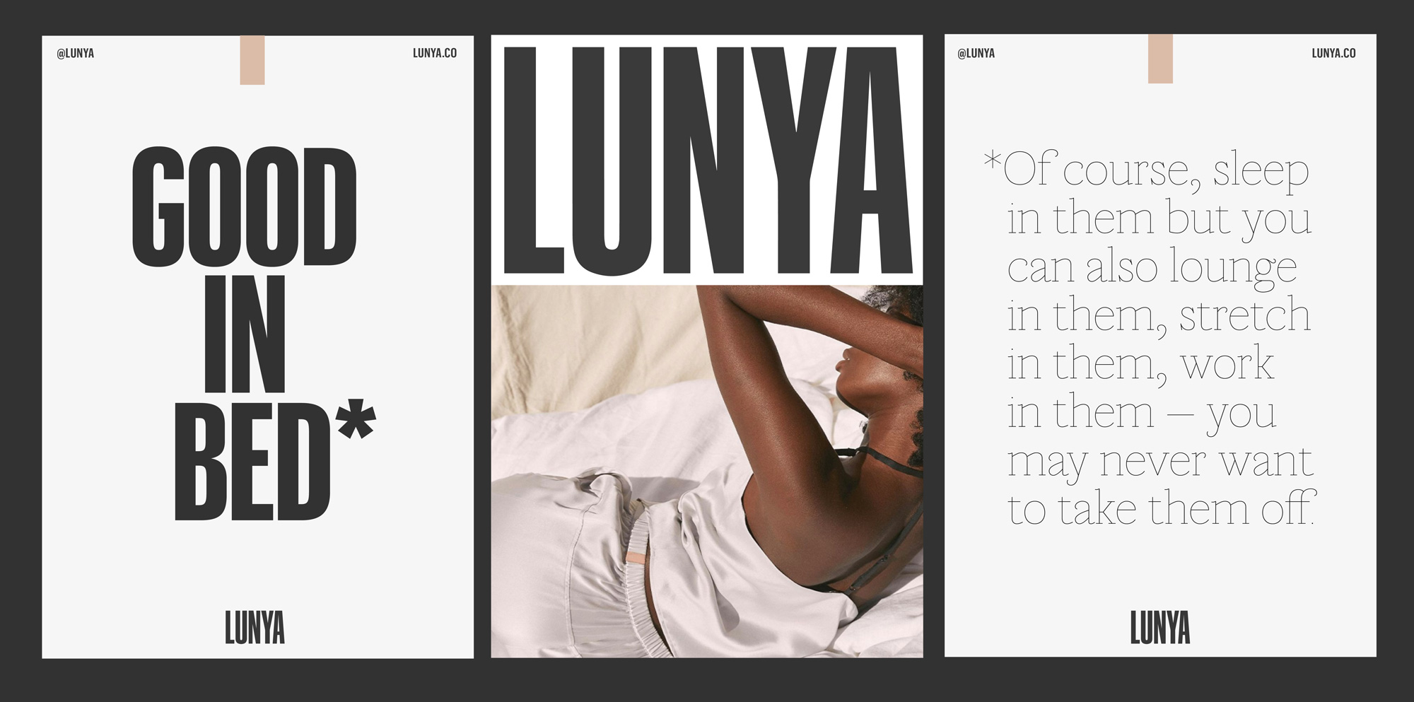
Lunya makes thoughtfully designed essentials with low-maintenance, high-functioning fabrics that are created for the everyday transitional moments. We infused the Lunya belief of fewer, better, more multifunctional items into an identity system that is stripped back and unfussy, but still packs a punch.
One of our challenges was to resolve the tensions between the soft and restful qualities of the product and the bold and confident nature of the brand. We did this by creating a high contrast system where the bold and utilitarian primary typeface (Graphik) is juxtaposed with a secondary display typeface (Marian) that is super soft and nuanced.
The extra condensed wordmark was inspired by long shadows that appear at dawn and dusk and we utilized the iconic light pink Lunya clothing tag to create an additional, but subtle, brand signifier within layouts.
As a sleepwear-focused company, Lunya had a tagline they loved — ”Good in Bed” — but they needed a way to communicate the multifunctional nature of their clothing items. Lunya products are also meant to maximize everyday leisure moments like resting, cooking, playing, learning, and contemplating. To help broaden the brand’s story and include these moments, we introduced an asterisk to the tagline that acts as a graphic way for Lunya to list all of the times and activities their products are made for.


©2021 EcoBrandNow Ltd
Do you love the hustle? View Career Openings