STRATEGY, DESIGN, TECHNOLOGY
‘15 - 21©
.svg)
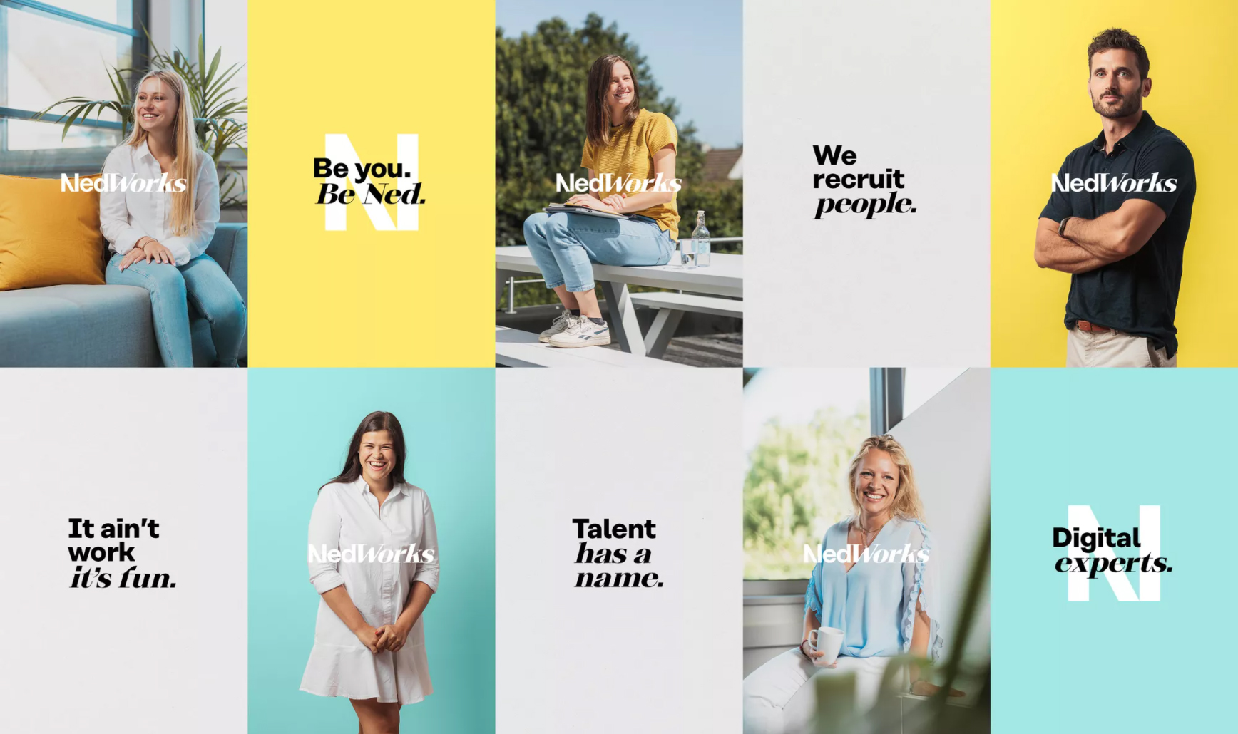
Digital talent recruiters Bloovi Me had lost touch with their own brand after years of digital talent spotting. The look and feel no longer matched the story they wanted to tell. Rethinken took up the task with them to challenge the HR sector and transform Bloovi Me into the brand it is today: NedWorks.
Tackling the visual style alone wasn’t enough. The brand had to be rebuilt from the strategy up. Business strategy, mission, vision, everything was tackled to enable the brand to reconnect with its target groups. Together, we laid the foundations for a promising future for NedWorks. Focus on connection, authenticity, humanity… It was from this personal approach that NedWorks went in search of its new voice.
A lot of attention was paid to the naming process. The new name had to live up to the challenger status, as well as embody the brand story.
The name contains a fictitious persona, which is a personification of the different target groups of NedWorks. The auditory feeling is firstly playful and ‘happy’, but the explicit part – ‘Works’ – emphasises what the brand is all about and provides the necessary double meaning.
The new brand identity of NedWorks is ‘out there’, extroverted, and wants to put the digital talent agency prominently on the map. Playful, yet serious. Personal, yet professional. Digital, yet human.
The graphic identity was formed around two different typefaces that communicate with each other and a contrasting color palette. The tone of voice is aimed at creating a sense of belonging and a sense of community.
The imagery style of NedWorks is spontaneous and human with a very authentic look 'n feel.
We determined the appearance of the imagery and all the images used were shot by our Rethinken photographers. It is a mix of their people and talents and gives the brand a face. The two types of images embody the identity of the new brand. Professional, yet lighthearted. They reflect NedWorks’ passion and way of working to the letter and create a distinctive effect with the competition that should not be missed.
The brand was rolled out via various communication media, but had to be very strong online. The translation of the brand identity into their digital world is very broad: from website to social media to a distinctive motion style.
We were responsible for the entire website process. From functional analysis to design to development, each phase was aimed at optimal user-friendliness, creating a community, and connecting talents, companies, and recruiters.

%20(1).gif)


.jpg)


.jpg)


%20(1).gif)

%20(1).gif)
.jpg)
.jpg)
.jpg)
.jpg)
.jpg)
.jpg)